Blog
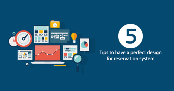
5 Tips To Have A Perfect Design For Reservation System
The website design for your reservation system is critical in a world where people stay online for most of the day. Depending on the product, up to 83% of consumers visit a company’s or service provider’s website before purchasing. Poor design can ruin all the efforts and months of planning. Thus, the appearance, usability, and accessibility of your website are more critical than ever.
You can design your web if you trust your skills. Hiring professionals to work on it would be better if you don’t. But, even if you hire someone, you should keep in mind these crucial things we listed below:
Less is more
In the world of web design, less is often more. Why will you fill the website with icons, pop-ups, badges, and banners that could be more useful to your site and distractive? A clean and well-designed website works best.
Catch the Client’s Attention
Leaving blank spaces is an excellent way to catch your client’s attention. In addition, the proliferation of aesthetic elements, if plugins and widgets accompany them, will make your site slow. Plugins and widgets attend 40% of internet users who expect a maximum of three seconds for a webpage to load.
Analyzes competition
You have to analyze the competition. It is what works best. Do not hesitate to track your competitors’ websites and write down what’s good about their sites. If the leader of your field has chosen a particular design and some certain colors and it works very well, it means something — do not you think?
The Text format is essential.
You must also ensure that your texts are easy to read. You must use the appropriate font and colors to make your customers comfortable. Moreover, the reader is important because you tell Google what products or services you sell. The tips to have clear text are:
1. The colors match
White text on white background is, of course, not right
2. The body font is right
So your client does not have to squint to read it. It should be neither large nor small.
3. The source is always the same
Do not confuse your customer.
The Design Should be Responsive
Could you make sure your website is mobile-friendly? It would be commercial suicide if your design were unsuitable for responsive mode since more than fifty percent of Internet searches are made via smartphones and tablets.
The best thing for a design is that it is simple and has the most critical elements at the upper left since when users land on your site, their eye path starts from the upper left corner, and moves on from there. Seek a balance with text is essential, giving information to your readers or customers and for Google to know what you’re offering.
Good software, such as the DeskFlex Facility Scheduling Software, has all the above features and allows you to have your website in different languages, customizing each with other content and images.












 Support
  Demo
Demo  Blog
Blog 